
The Craft of Typography
Almost as much as I love the craft of programming, I love the craft of typography. Pretty much since I remember of starting using computers I cared about the fonts and had an interest in tweaking the styling settings to make it read and look nicer.
But I wanted to actually know concretely about typography, so I followed the Introduction to Typography course by the California Institute of Arts.
Here, on my blog, I am free to choose whatever fonts I enjoy and to play with the sizes, spacing, colours, etc, which is cool since it’s nice to do something you enjoy for/on something you care about.
In the course, I have learned about:
- Type Anatomy, taxonomy and metrics
- Type history and its evolution
- Choosing a font
- Spacing and Composition
A Touch of History
I have loved and been interested in History since my young days, so I enjoyed a great deal to learn about the history of Type. In the old times all the typographic work was handcrafted by the scribes but since it was expensive, slow and error-prone, the Type built of metal blocks were created.
I found particularly interesting to learn that several versions of the same letter were designed in order to make the text look as if it was hand-written.
They started moving from the very decorated hand-written style into a more mechanical Type.
It was nice to learn about how much Type has evolved and was adapted accordingly to the context where it was being used. For example, bold, big and heavy Type was a must in order for your store or product to be advertised efficiently.
Equally interesting was to learn about the movement from Humanism to Rationalism and until the Modern Era, where fonts such as Bembo, Didiot, Clarendon, Futura and Helvetica ended up being not just fonts but also landmarks.
Type Anatomy
In general we categorise fonts as either serif or sans-serif, and that differentiation comes from the physical features of the type.
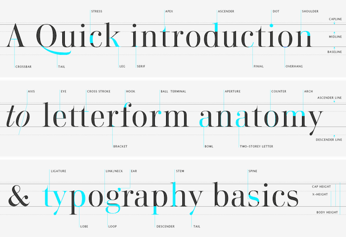
There are many variables that make a font unique, such as the x-height, the aperture, the axis, the thickness of the stroke, and so much more.
To know about these physical features helps to identify the differences between fonts and to better choose which font to use in a given case.
For instance:
- a font with a low x-height is a more delicate font, while that one with a high x-height is more sturdy.
- a sans-serif font is usually better for extensive body text since the serifs create an imaginary baseline, which eases the reading process.
- Fonts with a thinner strike horizontally than vertically makes it a good choice for fashion/feminine cases. Such a font is Didiot, used by Vogue.
Shape and Spacing
A piece of typography is both form, a visual element with shape, texture, figure and ground, and direction, and language, an expression of thought with grammar, syntax, and rhythm.
So as much as it may sound obvious, Type is not just about a set of letters put together but also the shape, space and the composition they form.
I found useful to learn about some tips on spacing. For instance, the longest the lines of a body text are, the higher the leading space must be. In any case, by having a too low leading, it gets hard to focus in one line and by having too much, there no longer is a sense of cohesion and unity.
About headings, especially when uppercase, it is advised to decrease the letter spacing (or kerning) or otherwise it will look like spread letters instead of words or sentences.
Apart from other spacing metrics such as margins, a very interesting thing I got to learn about is the negative space. Negative space may or may not also transmit meaning but it does always directly shows how dynamic the text will appear to the reader.
Hierarchy
Defining the hierarchy of a content is the process of making different types of content look different, reflecting the relative importance of different content using a different style.
As I have learned before in UX courses, proximity is a way to say that what is closer is related. Hierarchy involves all that.
One of the things I most enjoyed when first working in Agile, was that the work to be done was broken down into very clear, separate, small tasks. Not only it was clear what to do and how to start, but also the productivity was constant which made me engaged and willing to keep going.
Reading is very similar. If the spacing (separation) is not good, we just see a block of text ahead, which will take forever to read. It is not engaging like that, and we must make it friendly to the readers not just by writing good content but also by making it easy or even appealing to read.
Assignments
The first assignment in the course was to study a font. The submitted content in this first assignment was then the content to use in the other two assignments.
The second assignment was to train what was learnt about hiearchy and proximity. My submission was the following:

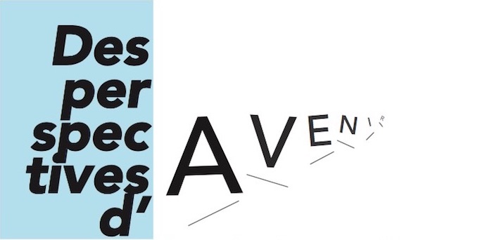
The third assignment was to design a typography poster. This was the most interesting one as some creative and boldness were required.
As inspiration work for the poster, we were asked the following:
What feelings, mood, time period, and ideas does it conjure up? If your typeface were a person, what kind of personality would it have?
Avenir means Future in french. Also, I associate Avenir with Winter, because I find it comfy and pragmatic, therefore the blue block. The main focus of the poster is the Future. “Avenir” in the title is represented in a way where the further the word goes, the less visible and more uncertain (rotation meaning uncertainty) it becomes. Also, the idea of steps (the future is built with many little steps) is involved in the text disposition and in the title as well.
You can have a look into it here:
Conclusion
I am quite interested in doing something related to Typography in the (near) future, either by helping people choosing fonts or by doing some simple consultancy such as on how to improve an existing work.
If you would like to exchange ideas with me about this topic please do so by emailing me!
By last but not least, I appreciate Natanael Gama, a typography craftsman, for his time to exchange ideas with me.