
The New Kidiyo Menu
The original design of the Kidiyo app, released in July 2018, received several negative reviews on the stores and from direct user contact. Get to know what was wrong and how I and Raissa Colonetti got the new Kidiyo app released.
It was unanimous at Kidiyo that our app was not good enough, and the users could tell us what was wrong. Long story short, the app required the users to take a handful of decisions before reaching the content. That’s too difficult for kids and the costs of a mistake (making the wrong choice at one of the steps) was too expensive. At a technical level, it was also not scalable, as each decision was implemented in a separate screen. That meant that adding new content required new decisions, i.e., new screens, which required a new version of the app to be released, which required long un unpredictable waiting review times from Apple.
I knew what I thought best for Kidiyo and its users. A menu and design a la Netflix/youtube, totally configurable from the backend, playful, easy, discoverable. And so I came out with the initial concept.
Concept #0
This first concept made the selected player a central point of the screen at the start. The feed of items offered a row of filters based on the type of content: all, videos, music, ebooks, games, etc.
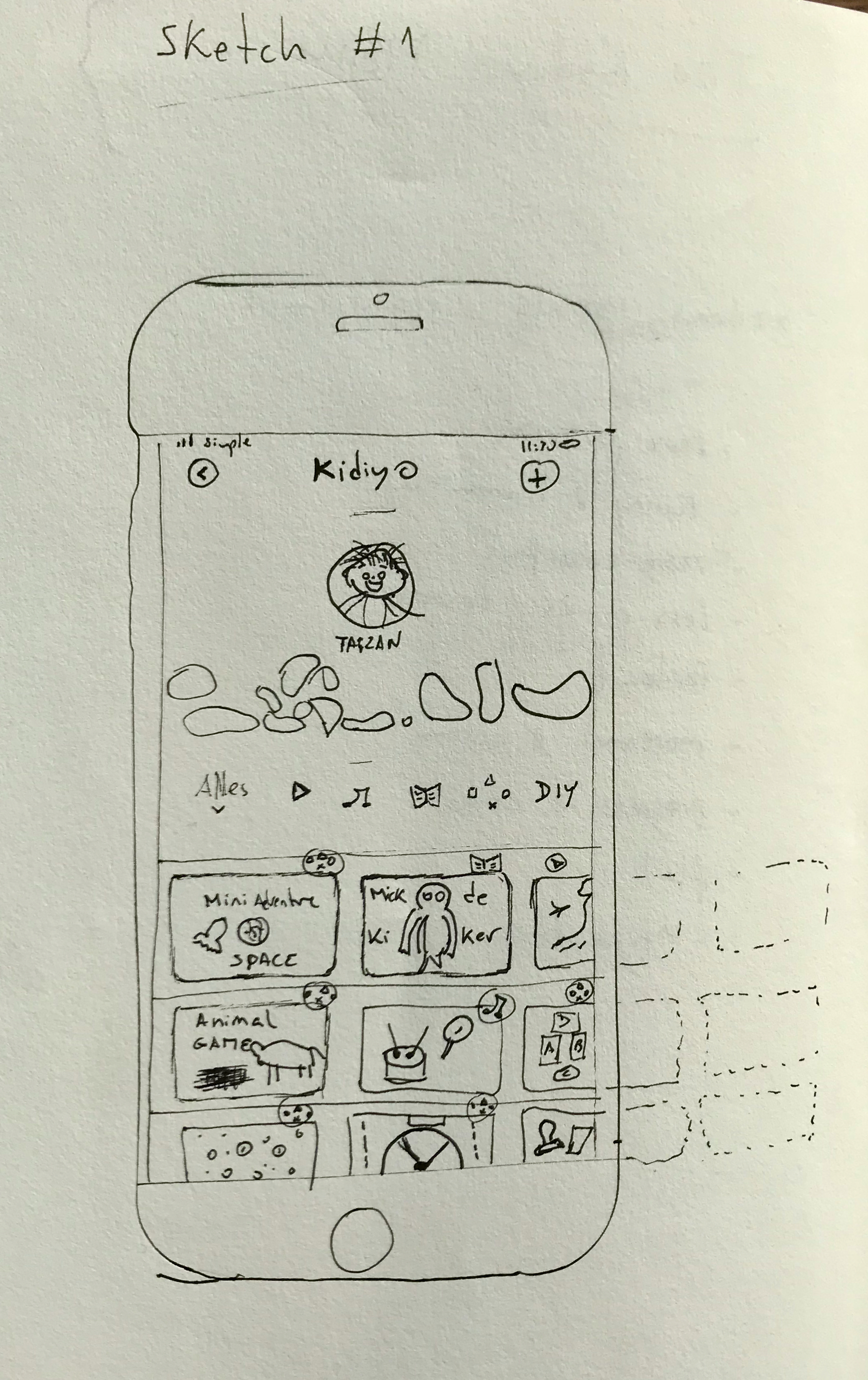
It was a good start to trigger the team and get us going. The next steps were to pitch it, create a usable prototype, learn and improve.
The Pitch
This presentation was followed by this demo video where the core concept is shown and explained.
The pitch was a success. However, the pedagogy advisory board had some critical comments on this new design. Mainly, they missed the idea of a character-based “world”, which is studied to be rather important for kids’ content.
User testing
After some adjustments, we went ahead and organized a user testing day in our office. Some parents signed in and we had both the parents and the kids going through the prototype. We made questions, took notes, observed, learned.
The overall feedback was excellent. Parents and kids loved the new concept and about all requirements were achieved.
We had built a prototype, now we measured so that we could learn. We now had green lights to implement and deliver value to our users!
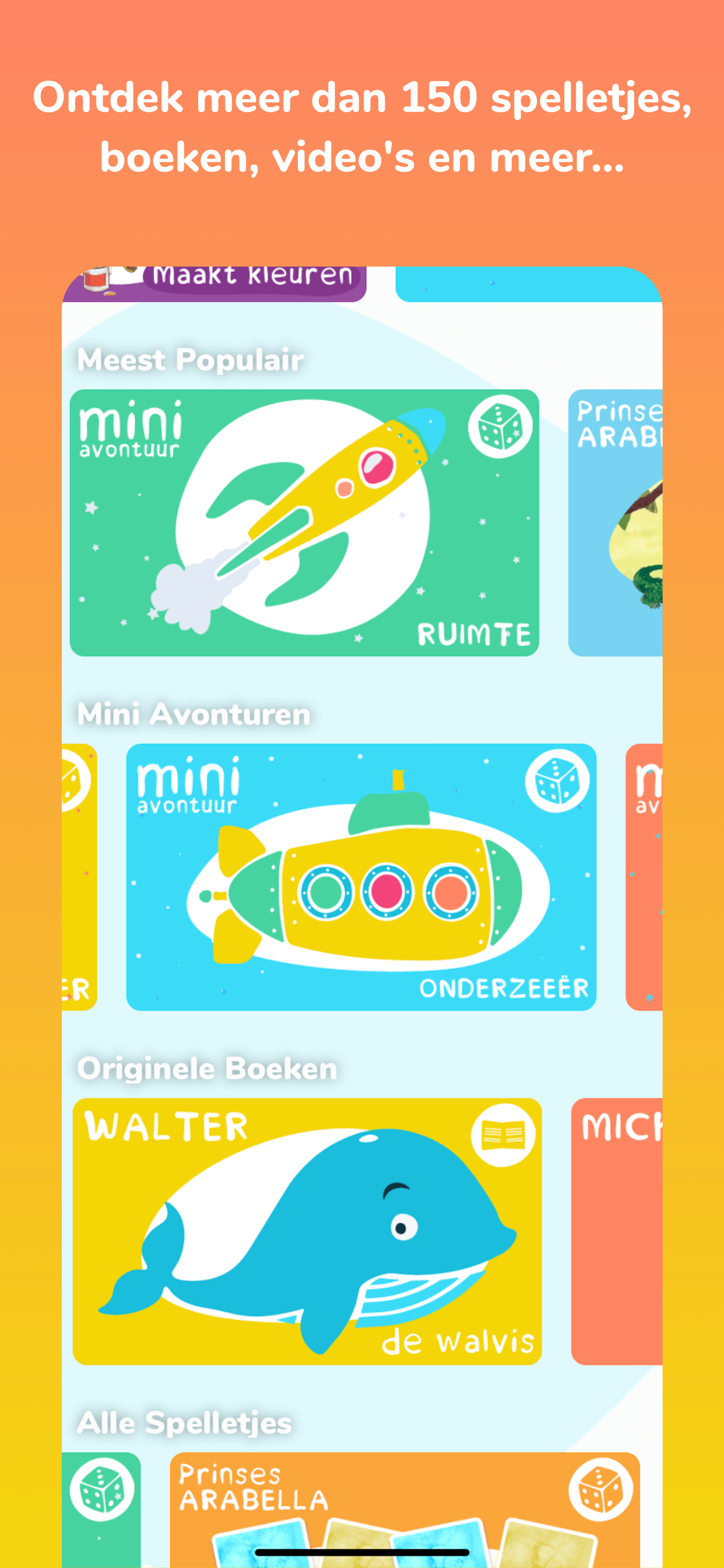
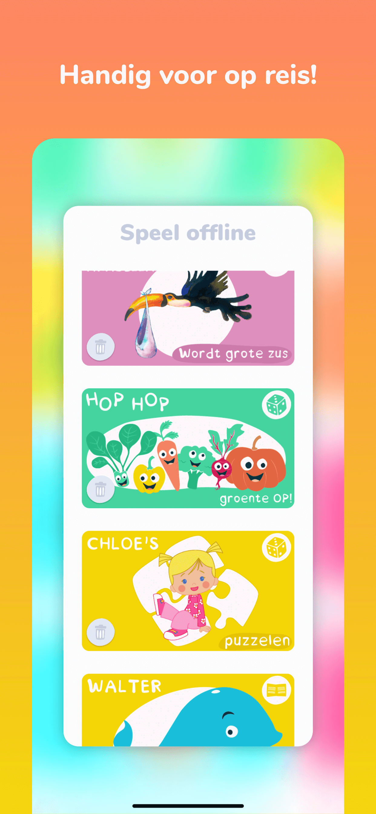
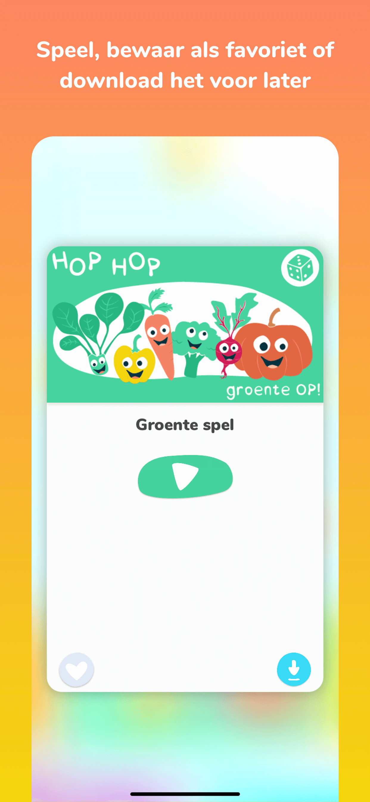
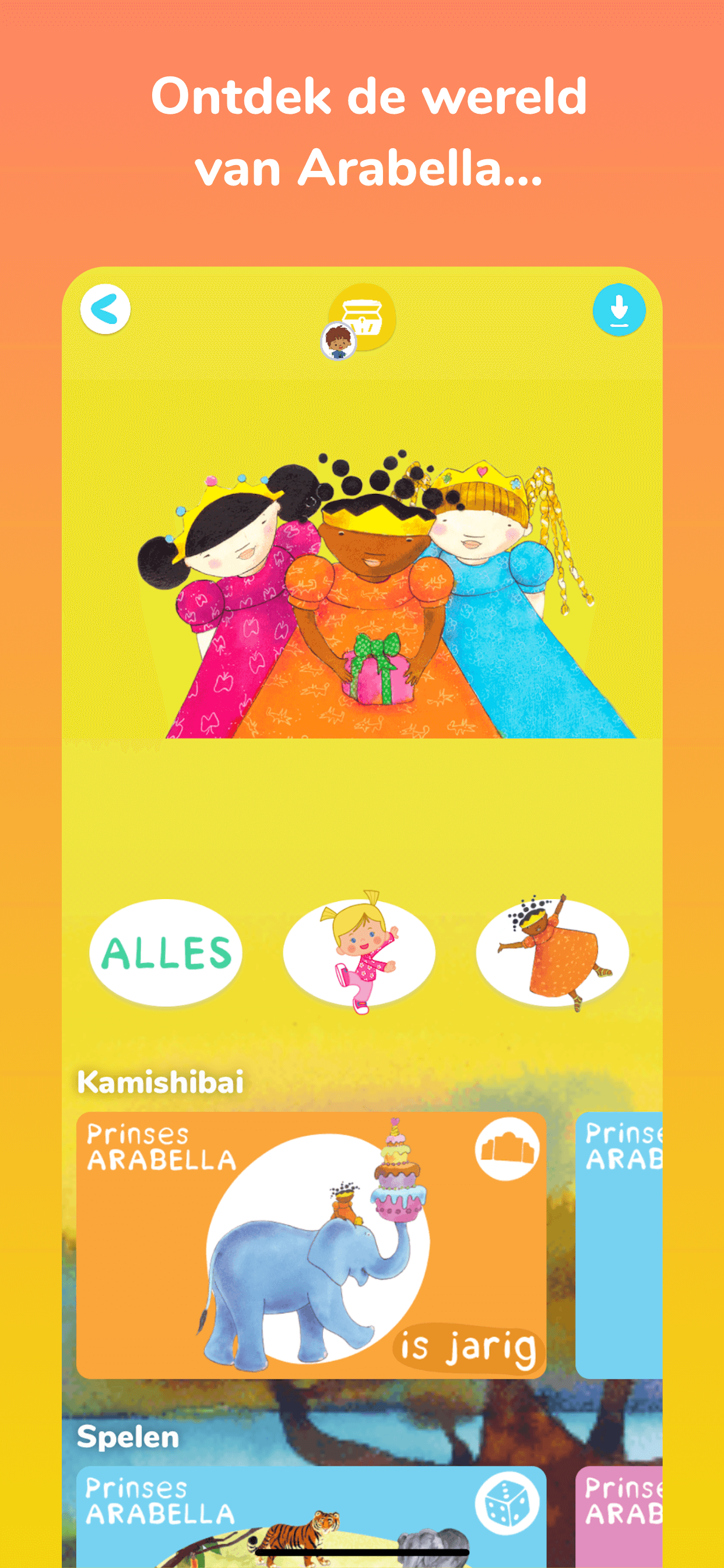
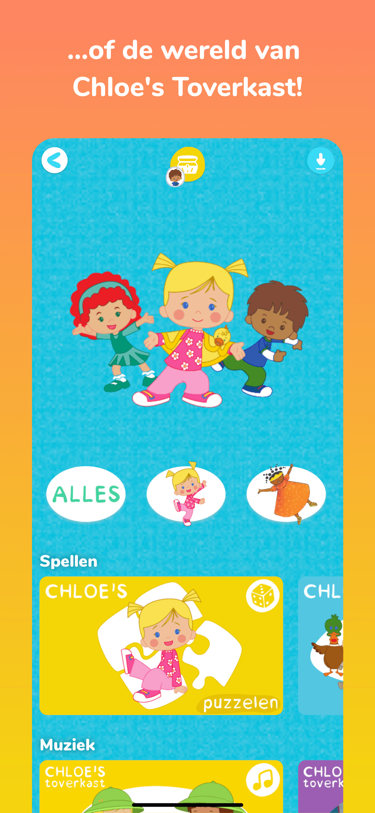
Kidiyo v2.0.0 🎉
At first, we always referred to this project as The New Kidiyo Menu when it fact it was more than just that.
I refactored the majority of both the iOS and Android apps to make this new version possible. All the thumbnails were redesigned and made consistent by Raissa. To make the menu configurable from the backend, I designed a simple DSL (Domain Specific Language) that is parsed and interpreted by the apps to generate the desired menu.
In the end, we found the result to be beautiful and exciting as shown below.


Credits
Concept developed by: Nuno Alexandre
Implemented and designed by: Nuno Alexandre & Raissa Colonetti
Company: Kidiyo, All Rights Reserved.